Little Bits
In this collaborative project, as the designated designer, I played a pivotal role in crafting the visual and interactive elements that brought our vision to life. One aspect the team focused on was content reduction. The site went from 21 pages to 15 pages. Adobe XD was used to create prototype for project.
- My contributions were multifaceted. From the initial conceptualization phase, I delved into the creative process, sketching out various ideas and concepts to refine our direction. These sketches evolved into detailed wireframes, providing a structural blueprint for the interface's layout and functionality.
- Transitioning from wireframes, I embarked on the journey of prototyping, breathing life into our designs. Through iterative development, I fine-tuned each element, meticulously ensuring coherence and usability. These prototypes served as invaluable tools for both internal review and user testing.
MoodBoard
I curated a comprehensive moodboard, encapsulating the essence and aesthetic of our project. This visual served as a guiding light, steering our design choices toward a cohesive and engaging end product.
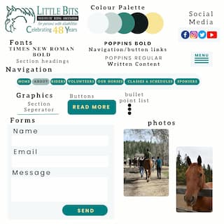
Colour Palette
The colour palette was taken from the logo and the colours are:
- Golden Glow
- Racing Green
- Teal
- Geyser
- Azure
The teal is on buttons, page section separators, and buttons. The golden yellow was chosen for an accent and it will be the button hover state and button text colour. The racing green will be the navigation text colour, written text colour, and hover state text colour. The geyser will be the navigation button background colour. The site background will be the azure.
Fonts
- DM Serif Display
- Poppins Regular
- Poppins Bold
The DM Serif Display is a unique font that is similar to Times New Roman. The Poppins is chosen as it has a darker and heavier weight compared to other fonts. I found this out when I researched other relatable fonts. This would be a good choice for ease of readability. The DM Serif Display will be for the headings, Poppins Bold will be for the navigation and button links, and Poppins Regular will be for the written content.
Graphical Elements
- Buttons
- Page section separators
- list bullet points
These were chosen for easier readability and to ensure the ability to get from one section of the site to another section easier; and more interaction from the user.
User Testing
User testing and research were integral components of my process. Leveraging insights gleaned from these endeavors, I refined and iterated upon our designs, ensuring they resonated with our target audience.
View final project